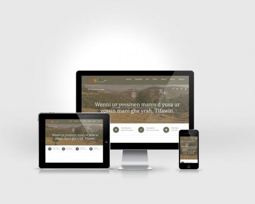
How Drupal works with Responsive Web Design?

Responsive web design term is related to the concept of developing a website design that responds to the user’s behaviour and environment based on screen size, platform and orientation. In other words, it provides a way for your site's content to be adapted to the device it's being viewed on. Responsive design uses a blend of flexible/fluid grid, media queries and flexible images to make a site responsive.
Usability Study: Unlike Women, Men Need Speed

In a recent usability survey, researchers from Southern Illinois University found that after ease of use, men prefer fast download speed to easy navigation. Women prefer ease of use, easy navigation, and accessibility. The researchers hypothesize that these different usability criteria are due to differences in how men and women use the Web.
Understanding Web Design, By Jeffrey Zeldman

We get better design when we understand our medium. Yet even at this late cultural hour, many people don’t understand web design. Among them can be found some of our most distinguished business and cultural leaders, including a few who possess a profound grasp of design—except as it relates to the web. Some who don’t understand web design nevertheless have the job of creating websites or supervising web designers and developers. Others who don’t understand web design are nevertheless professionally charged with evaluating it on behalf of the rest of us.